
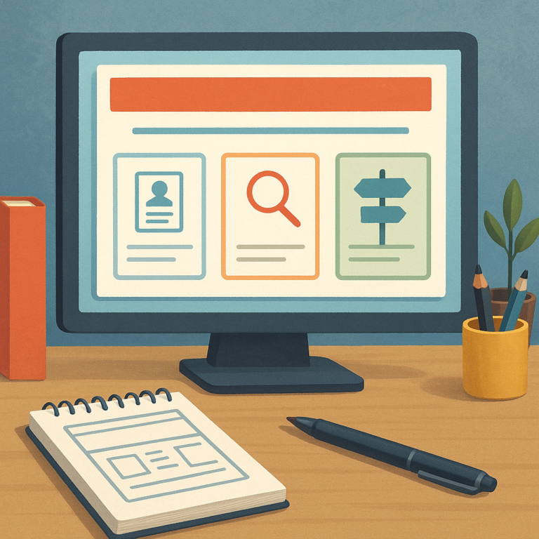
A job readiness homepage should do one thing immediately: help visitors understand where to begin and why they should stay. When someone lands on the page, they may be updating a resume, searching for open roles, or looking for practical advice that makes the process less overwhelming. The homepage must
answer those needs fast, while also feeling organized, trustworthy, and easy to explore on any device. The strongest approach is to build a clear path from the main promise to the most useful content. That means placing the core resources front and center, using plain language, and shaping the page
Lead with a simple value proposition
so returning visitors can move efficiently and new visitors can orient themselves without effort. Every section should support action, confidence, and clarity. Start with one sentence that explains the site in human terms. The message should tell visitors that the homepage helps them prepare for work, improve their materials,
and find opportunities without confusion. Keep the wording direct and practical, because a job readiness audience is usually scanning rather than reading deeply. The headline and subheading should work together to show usefulness at a glance. A clear value proposition also reduces bounce rate because it confirms that
the site matches the visitor’s goal. Avoid vague language about growth or success without specifics. Instead, name the major outcomes the visitor can expect, such as resume support, job listings, and advice for moving through each stage of the search. That combination creates immediate relevance and trust.
Feature the three core content areas
The homepage should highlight the main sections that matter most: resumes, jobs, and candidate tips. These three areas give the site a clean mental model and help people choose quickly. Use cards, buttons, or a visual row of featured panels so each category feels equally accessible. Visitors should never have to guess where to click first. Each
area should have a short description that explains its purpose. Resume content might focus on templates, examples, and editing advice. Job content can point to search tools, listings, or location-based opportunities. Tips should include interview preparation, application strategy, and workplace readiness. By grouping content this way, you create a homepage that feels helpful rather than crowded.
Make each section instantly scannable
Scannability matters because many visitors will arrive with a single task in mind. Use strong labels, concise text, and consistent visual hierarchy so the three core areas are easy to compare. A small icon or image can help, but the text must do the real work. Keep each block focused on one promise and one action.
Add popular resources and quick links
Beyond the main categories, the homepage should surface the most visited or most urgent resources. This is where quick links become valuable. A visitor who already knows what they need may want to jump straight to cover letter help, application checklists, interview
questions, or a featured guide. These shortcuts save time and make the site feel responsive to real user behavior. Popular resources also give the homepage a sense of momentum. When people see that others rely on certain materials, they are more likely
to trust the site’s curation. Place these links in a visible section that is easy to update over time, and avoid overloading the page with too many choices. A small, well-chosen set of links works better than a long directory.
Use trust-building elements that feel practical
Job seekers want guidance they can rely on, so the homepage should include signals that build confidence. This might include a short editorial promise, a note about who the content is for, or proof that the site is designed to support
multiple stages of a search. The goal is not to impress with jargon, but to reassure with clarity and consistency. Trust grows when the design also feels stable. Use readable typography, clear spacing, and predictable navigation so visitors do not feel
lost. If the site includes testimonials, success stories, or contributor information, keep that content concise and credible. The homepage should communicate that the site is maintained with care and that its advice is meant to help users take practical next steps.
Show that the site is current and maintained
Freshness matters on a job readiness site because users expect current guidance. A small update note, a featured new guide, or a clearly labeled latest resource can signal that the site is active. Avoid cluttering the page with dates everywhere; instead, use subtle cues that the content is reviewed and relevant. This keeps the experience tidy while still building confidence.
Design navigation for fast decision-making
Good navigation helps visitors move from uncertainty to action. The homepage menu should use simple labels that match real search intent, not internal department language. If someone is looking for resumes, jobs, or advice, they should see those options immediately. Limit the number of top-level choices so the path stays clear and the page remains easy to understand.
Navigation should also support two common audiences: first-time visitors and returning users. New visitors need a guided overview, while returning users want shortcuts to their preferred tools. A balanced structure can serve both by offering a prominent start here area alongside direct links to the most-used sections. That combination makes the homepage feel efficient and welcoming.
Include a welcoming call to action
Every effective homepage needs a final invitation that helps visitors move forward. For a job readiness site, the call to action should be friendly and specific, such as starting with a resume guide, exploring open jobs, or reading a practical tip sheet. The wording
should remove pressure and encourage small, useful actions. A warm tone works especially well for people who may feel discouraged or unsure. The call to action should also fit the purpose of the page. Since the homepage is a starting point, the next step
should feel obvious rather than dramatic. Offer one primary button and perhaps one secondary path so users can choose what matters most to them. When the page closes with a clear invitation, it becomes easier for visitors to continue their search with confidence.
Keep the layout simple enough to scale
A homepage content plan should anticipate growth. As more guides, tools, and job resources are added, the structure must still feel orderly. That is why the best homepage architecture relies on repeatable sections, consistent headings, and flexible blocks that can be updated without redesigning everything. Simplicity at the start creates room for expansion later. When the
layout is easy to maintain, editors can keep featured content fresh and relevant. It also becomes easier to test what visitors use most often and adjust the page accordingly. A scalable homepage is not bare or minimal for its own sake; it is organized so that the most helpful information always stays visible and usable.
Balance usefulness with a calm visual tone
A job readiness homepage should feel energetic, but not chaotic. Visual calm helps the content do its work. Use enough contrast to guide attention, but avoid too many competing colors, oversized banners, or unnecessary animation. The page should feel like a dependable workspace where visitors can focus on the next step without distraction. That calm tone
also supports accessibility and usability. Clear buttons, readable text, and uncluttered spacing make the homepage easier to navigate for everyone. When the design and content cooperate, the result is a page that quickly directs visitors to the right resources while still feeling friendly, modern, and trustworthy. A thoughtful homepage plan turns first impressions into action.
